Reimagining a site navigation
On review of the current site navigation it became clear that it was not serving customers as well as it could and potentially losing directly booked accounts for the business.
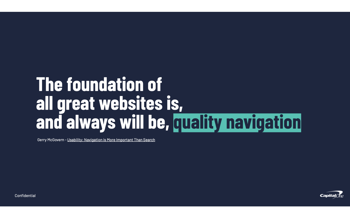
Reimagine the website navigation system to enable users to quickly find the information they need and to better showcase Capital One's products and services so that customers can find the right credit solution.
Through extensive research, ideation and testing we were able to explore and design an improved and better standardised navigation flow that meets the customer's self-serve preferences.
The validated solution was built using a component based UI for a logical and cohesive layout. A dramatic increase in usability, resulting in less call volume and decrease in time to find information from upwards of 100 seconds to less than 8 seconds.

Project lead
Desk research, card sorting, scenario testing, data analysis, HMWs, brainstorm facilitation, journey map, site architecture mapping, prototyping, user-testing, presentation.
Process
Discovery
Leading the initiative I began with an extensive audit of the current site navigation, analysing the layout and positioning of the links listed under the top navigation.
Early usability testing and a review of site traffic insights confirmed our hypothesis that the current design was not serving our users as best it could with unorganised, unappealing, crowded, and jargon heavy content resulting in a high cognitive load for users.


My team of three, myself, a UI Designer, and UX Copywriter, ran a series of tasked based scenario tests to gauge how long it took for participants to find the information they needed for each scenario. One scenario proved painful with over 100 seconds taken to locate a specific information link.
Competitive analysis also showed that we were far behind others in the industry in terms of visual appeal and logical link categorisation.
Ideation
Following our discovery I brought together a large cross-discipline group of participants for an ideation workshop to review our findings and begin to ideate on feasible solutions. I also conducted a card sorting exercise to help with improved categorisation of link placement.
Further ideation refinement and rapid prototyping, within our smaller team, allowed us to bring a number of concepts into testing.
Testing
We put our low-fidelity prototypes into multiple rounds of validation, both facilitated and non-facilitated, proving an invaluable step in our understanding of what new solution would work best. We again ran scenario task based testing to prove out the new placement and labelling of link information. Higher-fidelity prototypes were used to A/B test the visual components of the designs.
In general, the new designs and condensed list of categories and subcategories enabled participants to perform better at the tasks presented to them.


Development
Finally, the design was taken through a final round of design refinement as we built out a component based UI and additional responsive views.
Throughout this rigorous process I took every opportunity to share our work across the business, leading to the prioritisation for the implementation of this piece of work.


