Establishing a unified data visualisation standard
OMNI is a system of reusable components, patterns & recommendations – created to help teams build cohesive customer & associate applications.
Establish data visualisation standards and best practices across the enterprise and for the OMNI design system.
A certified accessible and unified standard approach to data visualisation across the enterprise.
Our research and collaboration allowed for collective alignment across multiple groups within Capital One. The artifacts and symbols created, enable teams to further test and refine.

Product design lead
Desk research, use case gathering, alignment workshop, accessibility tool testing
Process
Discovery & Definition
Collaborating with a fellow product designer our research kicked off with a deep dive, canvassing internal and external insights about data visualisation and accessibility best practices. Our plan of action; was to seek out existing efforts, including the internal data experience team, accessibility team, and academic research.
From our discovery we were able to bring together goals for our exploratory efforts.
Color
- Perceptual Meaning, utilising colour meaningfully to appropriately support different types of data sets
- Flexibility, Support all use cases AND formats (i.e. print) within the commercial bank by providing a variety of options and flexibility
- Robust to colorblindness and contrast minimums, supporting at least the most common of colour vision deficiencies with the goal of supporting all
- Aesthetically pleasing, supporting the core Capital One palette
Structure
- Build on Foundational, existing best practice patterns
- Flexibility, supporting unique business use cases
- Responsive scaling, supporting multi view states
- Aesthetically pleasing, complimentary to the existing design system
Testing
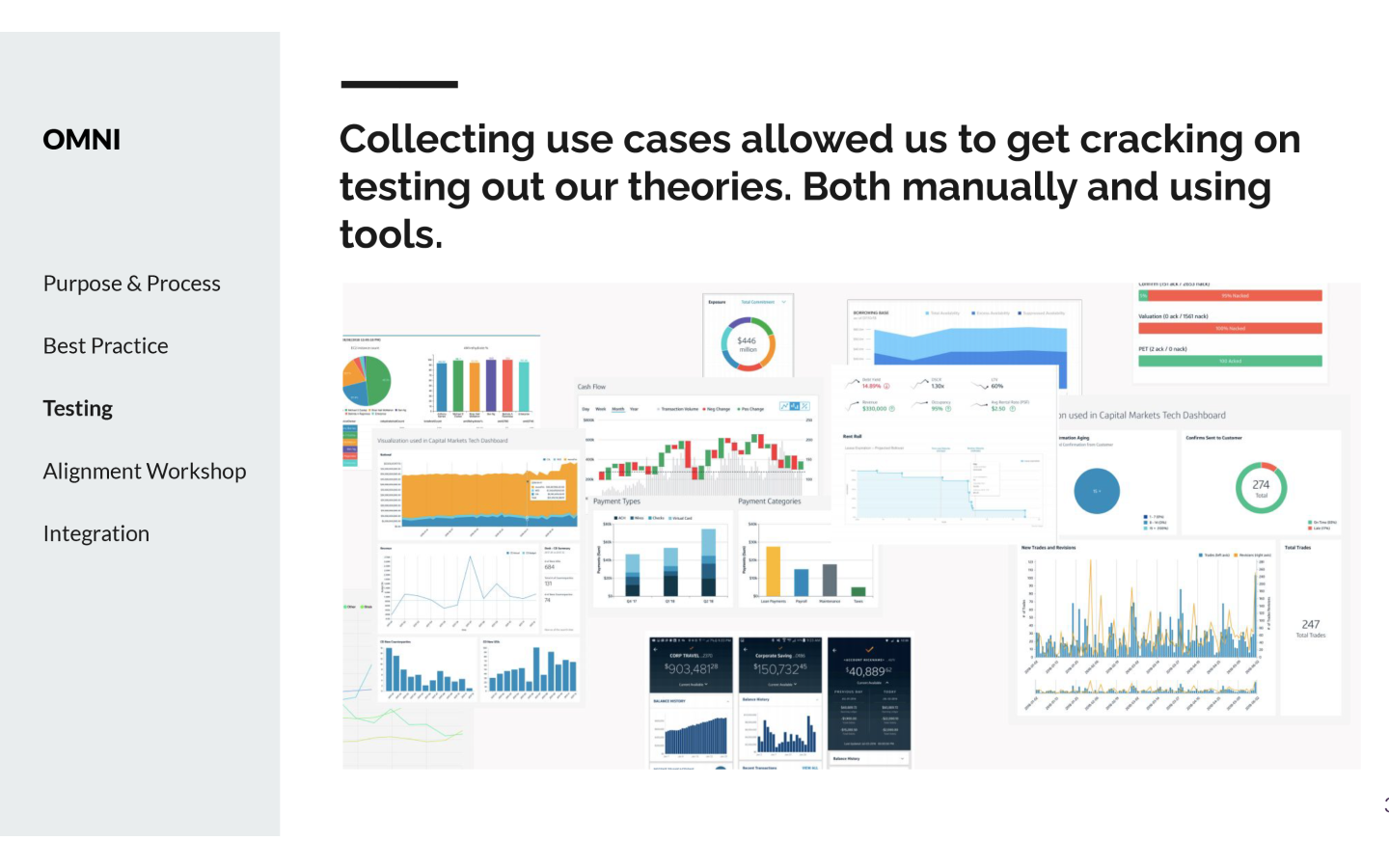
We collected use cases from across the business which allowed us a clear picture of the types of data visualisation in circulation. We then proceed ed through a rigorous testing schedule using automated and manual tools to test our theories.

Alignment
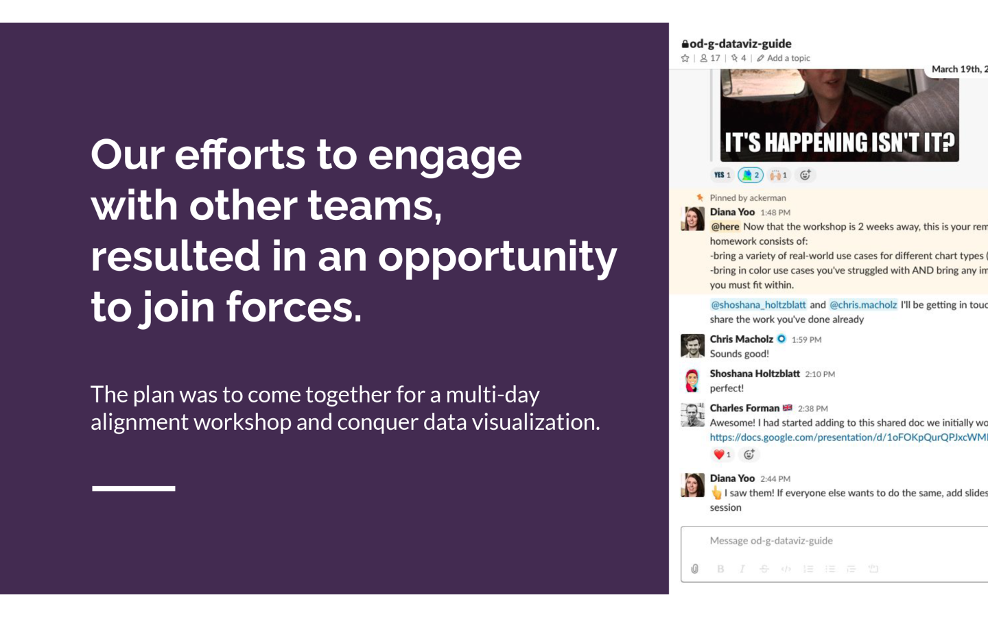
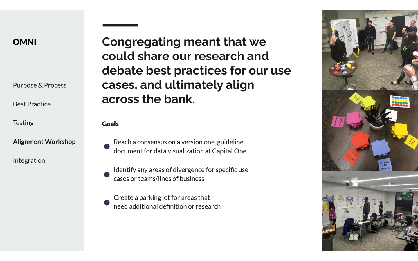
Our efforts to engage with other teams, resulted in an opportunity to join forces. The plan was to come together for a multi-day alignment workshop and conquer data visualisation.
Congregating meant that we could share our research and debate best practices for our use cases, and ultimately align across the bank. We set out to achieve three goals:
- Reach a consensus on a version one guideline document for data visualisation at Capital One
- Identify any areas of divergence for specific use cases or teams/lines of business
- Create a parking lot for areas that need additional definition or research
Integration
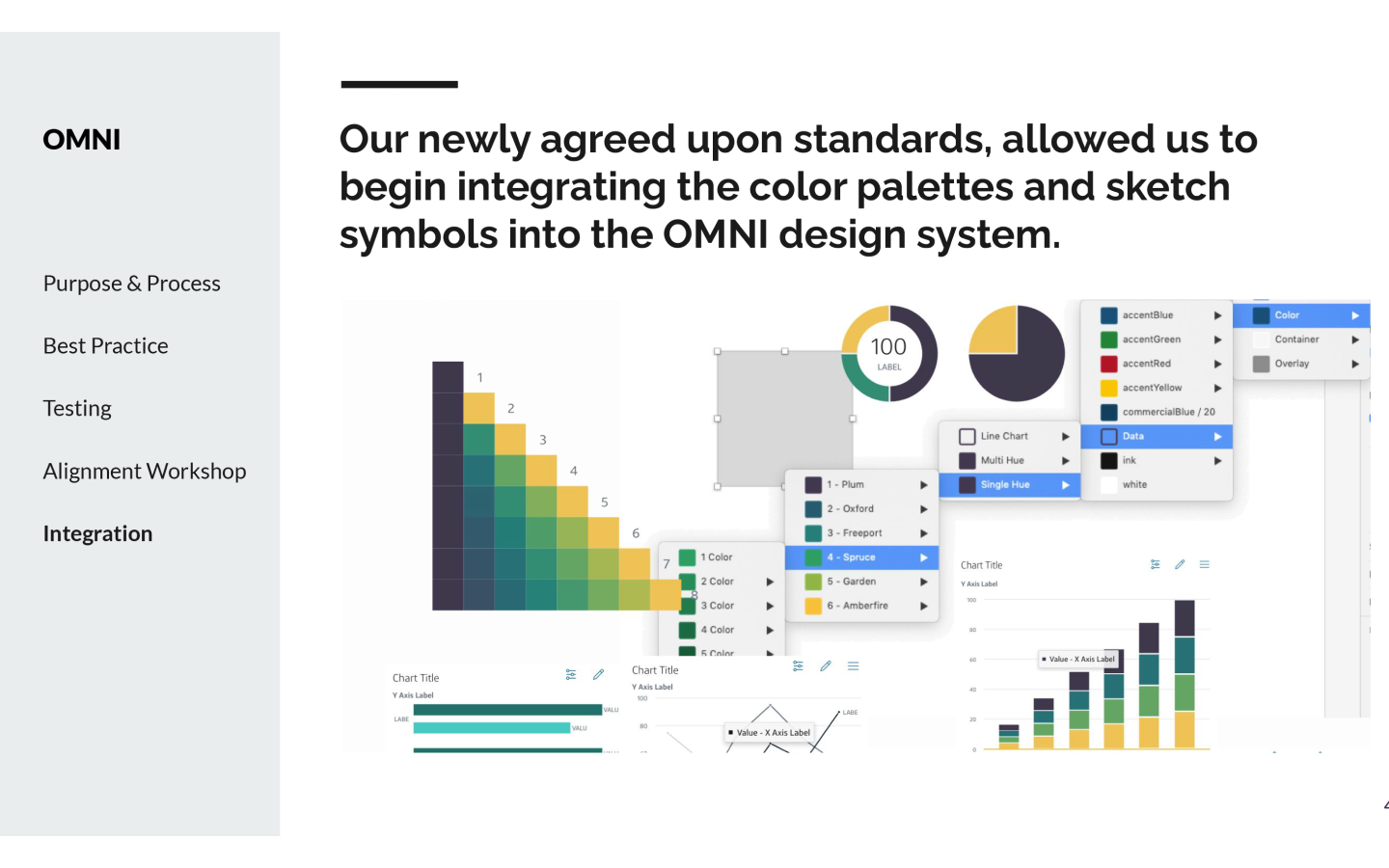
Our newly agreed upon standards, allowed us to begin integrating the colour palettes and data visualisation system symbols into the OMNI design system.